
How to Create Album Visuals Like You’re Harry Styles
You’ve probably seen Harry Styles online recently. Whether it’s Coachella recaps, album awareness, or about his new record-breaking single, ‘As It Was,’ the man is hard to miss. If you’re paying extra attention to Harry’s digital presence, then you’ve also probably noticed that he keeps his visuals tight, like really tight. In a new industry landscape where almost every song holds “radio hit” single status to feed streaming platforms’ personalization algorithms, I personally find it quite lovely seeing a concept album return in the most public of public eyes. It feels like f o r e v e r since Beyonce’s Lemonade.
The way that Harry is cohesively connecting his songs and their visuals (heck, even his press releases, and live performances) can be intimidating to the average musician. He has a brilliant team and the budget to support their collaborative ideas. However, at the core of what he’s doing are things any musician at any level can apply to their own releases. After all, isn’t the heart of music storytelling? That being said, here are 5 neighborly tools you can borrow from Harry’s House to have a succinct visual strategy around your next album release.
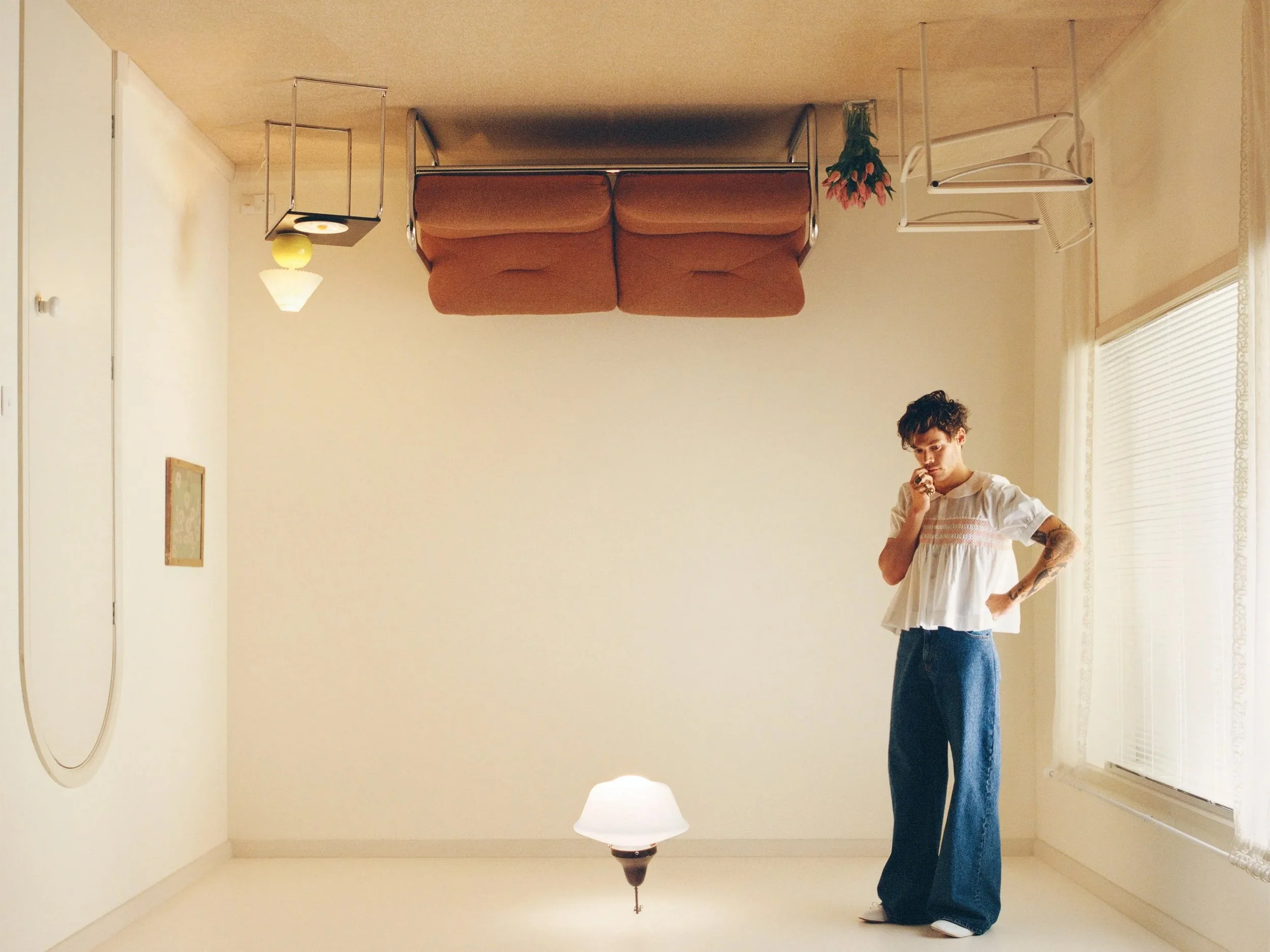
Identify the story. Finding a common theme throughout an album can give you something to talk about with your listeners. Connecting songs can lead to connecting treatments for your music videos. Harry is inviting people to his upside-down house in his album artwork, his first single being about the way things used to be.
Identify the colors. It’s no secret that there is a psychology to colors. Once you have a story and mood, pick a few colors that match. Having 4-5 colors is great for future pieces of content like merchandise, posters, and lyric videos. It also helps with general upkeep like social skins, website design, and email campaigns. Harry has gone for vintage shades of primary colors.
Locate visual cues. Do you have settings where your songs take place? Is someone drinking coffee or standing in the rain? Can you integrate little illustrations from these lyrics into merch designs or album artwork? Every reference is another opportunity to bring the conversation back to your music. For instance, Harry is using furniture in his merch illustrations, as you see in his album artwork.
Be intentional with your photos (and music videos too). Are your songs taking place at night? Take photos with a flash when it’s dark. Are your songs about the fall, but you’re prepping for the release in the summer? Go inside, crank the AC, and wear a sweater. Make sure whoever is editing knows your color palette! If you’re singing about a late-night bar fight, photos in a cornfield at noon might not be the matching vibe. Harry’s photos and content are light and airy, nothing is too heavily shadowed or overly filtered. They feel clean, with notes of a nostalgic vulnerability.
Choose an appropriate typeface. We love a chunky serif these days (we’re all Directioners here, think Niall Horan’s Heartbreak Weather artwork or even the Pleasing logo), but I wouldn’t expect an electro-pop artist to be using one (Zayn pain can strike at any moment). Typography communicates emotion too! Make sure you’re picking something for album art and social skins that feels appropriate to what you’ve created, and mostly just don’t use Comic Sans. Ever.
There’s a lot in your songs for you to lean on for your visuals. If you wrote and recorded a whole album, I’m really proud of you. You did a lot of work and I think Harry would be proud of you too. After all, he’s welcomed us warmly into his inner world.